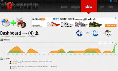
whos.amung.us is a popular widget used by many websites and blogs. This website informs us about total number of users present online at a particular time. Suddenly few hours back site was not showing properly and stats and all the page was not properly configured. Now suddenly when I checked it was completely new with a new look. This site was upgraded to HTML5 and CSS3 and it looks cool. Just see the screenshot below.
We could notice that this website now has a clear visibility of social bookmarking icons like Facebook, Twitter and Google plus. Hopefully they can increase their social networks. They also have changed the appearance of the graph. Events its widget page has been neatly designed with J query so that it could have a smooth sliding effect. Only defect is with the pro login link at the right corner which should be place somewhere else because it is not allowing us to click.
Coming to the map the red dots have been replaced by bookmark images with red and blue. Red indicating the present active online users and blue indicating the already visited ones.
Popular file hosting sites like Mediafire and Box.net too were looking awesome after changing their look. Sites these days are concentrating more on the look and feel to increase their customer database as look is playing a key role in determining a site to make users feel it as a pro site. So whatever it is whoever are planning for a site need to concentrate more on the look and its appearance.


Post a Comment